Anyone who knows me will tell you that I live in neutrals, regardless of the time of year. Even now, in spring—a season synonymous with bolder, brighter colours—I rarely stray from the black, white and grey hues that remain within my comfort zone. As a minimalist, these pared-back tones are my go-to, but to be honest, they often feel too same-y and a bit boring, especially in the warmer months. So, for spring 2026, I’ve been on the hunt for some fresher colour combinations that look elevated and chic without feeling too out there.
And it’s clear from the spring/summer 2026 runways that the minimal, “quiet-luxury”-inspired hues that dominated last year are taking a backseat to brighter colours that will add interest to an outfit. However, if you’re a pared-back dresser like me, this doesn’t need to feel intimidating at all. From deep plums paired with rich onyx to mood-boosting buttery yellow worn with pretty powdery pinks, it’s clear that fashion people are taking the fun that comes from injecting brighter colour into their outfits and combining them with more muted hues that still feel wearable this season. And below, I’ve rounded up the seven elegant colour combinations that look cool for 2026, are easy to copy and remain well within my comfort zone.
Keep scrolling to discover the seven colour combinations that every it girl will be wearing in spring 2026.
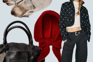
1. Cherry Red + Caramel

Style Notes: Practically a neutral in the wardrobes of fashion people these days, cherry red is one of the biggest colour trends of both last and this year. It’s bold, eye-catching, and most importantly, pairs well with all neutrals, including camel tones, as Chloe Butler has proven above.
Shop the Look:

Miu Miu
Suede Blouson Jacket
This is high up on my luxury wishlist.

TOMMY HILFIGER
Relaxed Wide Leg Pure Linen Trousers
Linen season is finally here!

ALAÏA
East West Nubuck Tote

cos
ASYMMETRIC JERSEY MIDI DRESS
Wear with sandals, trainers and ballet flats alike.
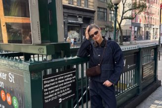
2. Midnight Blue + Chocolate Brown

Style Notes: Midnight blue and chocolate brown are hues you might initially expect to see throughout the colder months; however, Sylvie Mus makes a very good case for bringing this chic colour combo into the spring season as well. Both shades act as softer alternatives to black that feel a lot less stark, but they also remain wearable and pared-back.
Shop the Look:

Barbour
Hartland Knitted Polo Shirt
Perfect for those chillier spring days.

H&M
Coated Skirt
This skirt looks way more expensive than its £28 price tag.

ralph lauren
Satin Slip Dress
Between the deep midnight hue and the slinky satin fabrication, this dress is so beautiful.

Malone Souliers
May Clutch Bag
Dark brown suede will always get a yes from me.
3. Powdery Pink + Butter Yellow

Style Notes: Pale, buttery yellow has been trending for a few years now, but it feels no less relevant in 2026. The way to make it feel really fresh for spring? Pair it with the soft, powdery pinks that were spotted all over the spring/summer 2026 runways.
Shop the Look:

With Nothing Underneath
The Classic Shirt
This will act as the base layer for so many of your spring outfits.

MANGO
Straight Linen-Blend Trousers
Yes, to this entire outfit.

Reformation
Cecilia Linen Dress
The perfect spring event dress.

Boden
High Cut Ballet Flats
These will go with everything.
4. Forest Green + Slate Grey

Style Notes: Grey can sometimes feel a bit boring, especially throughout the spring and summer, but pairing it with a chic forest green hue will easily take this shade from simple to sleek. I love how both of these hues are muted and pared-back but also manage to feel fresh and elevated.
Shop the Look:

Sézane
Samuel Jumper
Wear on it’s own now, and layer it over a white button-down shirt come autumn.

Weekday
Low Rise Loose Pleated Suiting Shorts
Bermuda shorts are the warm-weather alternative to tailored trousers.

DEMELLIER
The Stockholm Large Leather-Trimmed Suede Tote
Demellier’s viral Stockholm tote now comes in this forest green suede iteration.

MANGO
Patent Heeled Shoes
No one will guess these are from the high street.
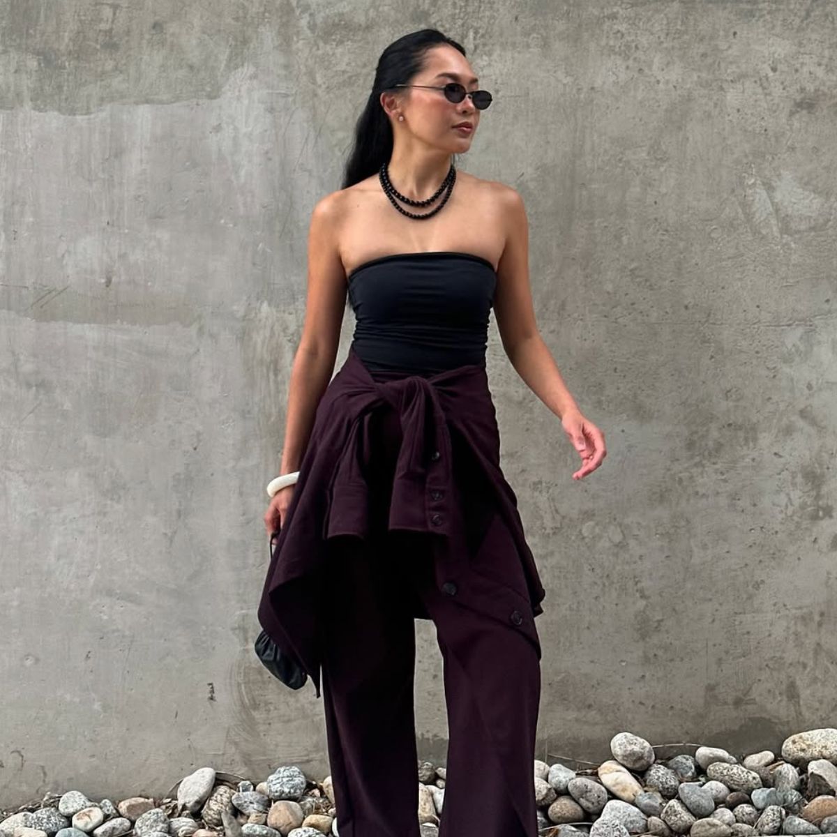
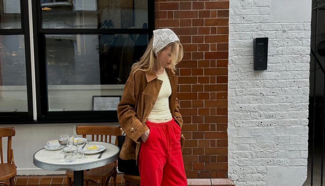
5. Plum + Ink Black

Style Notes: After burgundy hues dominated last autumn and winter, its more vibrant older sister, plum, is taking the forefront for spring 2026. To make it feel wearable, I’d take a cue from Dawn Tan and pair it with simple but chic black hues.
Shop the Look:

ME+EM
Fluid Evening Tank
A simple satin tank will serve you well on spring evenings out.

reiss
Wide-Leg Suit Trousers
You’ll reach for these in autumn and winter, too.

COS
Longline Linen Shirt
The styling possibilities are endless.

Whistles
Tier Hem Cotton Skirt
6. Chartreuse + Cream

Style Notes: Regarded as BRAT green’s sophisticated older cousin, chartreuse is the colour trend that I don’t think any of us ever saw coming. It’s a controversial one for sure, but this vibrant hue can easily be grounded by pairing it with elegant cream and ecru shades.
Shop the Look:

Michael Kors
Merino Wool Sweater
This comes in four other wearable shades.

Free People
Chilco Maxi Skirt

Gucci
Oval Frame Sunglasses
Accessories are the easiest way to incorporate colour into an outfit.

french connection
Raquel Bermuda Shorts
Just add a chartreuse knit and heeled flip-flops.
7. Ivory + Onyx

Style Notes: If colours just aren’t your thing, then you can never go wrong with pairing black and white together. More elevated than simply going head-to-toe monochrome, but still minimal and pared-back, this fail-proof combo will literally never date.
Shop the Look:

& Other Stories
Zip-Up Twill Jacket

Mint Velvet
Satin Lace Midi Skirt
The white contrast lace hem is so simple, yet so effective.

H&M
Wide Ultra High Jeans

pullandbear
High-Heel Sandals
Heeled flip-flops are big news for 2026.
Explore More: